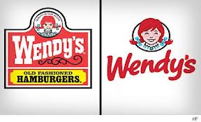
Here we go again – – so as not to be left behind in the frenetic dash for the fast-casual dollar, Wendy’s has decided to update its brand look, and just revealed its new logo. Below is a timeline of the Wendy’s logos, with the newest (targeted for March 2013 as part of an overall brand upgrade) on the right. This new logo will supplant the current one which has been in use since 1983.
And here is a sneak peek at what the Wendy’s Of The Future looks like:

The stated goal is to ‘energize the brand and dramatically improve the customer experience’, to which effect new restaurants will include things like lounge seating, flat-screen TVs, Wi-Fi and digital menuboards.
So what are we to make of this?
Wendy’s, like other chains (most startlingly Taco Bell’s Cantina Bell menu buildout) is trying to nudge itself a bit more upscale to compete in the fast-growing fast-casual segment that has been boosted by the success of chains like Panera and Chipotle – – relatively quick and relatively inexpensive fare that has the benefit of being (or appearing) freshly made to order (and with implied –but not always actually delivered — healthier profile).
The jury is out with me on how Wendy’s will fare with these changes, although I’m also the guy who thought Ebay wouldn’t catch on. In the context of the fast-feeders like McDonald’s and Burger King, Wendy’s carved out a niche as old-fashioned (and its implicit positives of freshness, good ingredients, heartiness, honesty, etc), which was reflected in the old-timey font, and the assurance of the red-headed lass wearing a nice awning striped frock (certainly the most appealing in a competition with Ronald McDonald and Burger King guy). If you squinted it would almost conjure an image of bygone days where you sat down and ate a meal at a restaurant with Formica tabletops and ketchup bottles on the table and waitresses and things like that. And if I remember correctly, Wendy’s also was among the first to use actual slices of real tomato, which slid off while you were eating, just like you might experience at home (except I don’t remember a single picnic with square homemade patties, but that’s another story).
So in trying to compete with the fast-casuals like Panera (upscale suburban, friendly), Chipotle (authentic, semi-hip) and even Cantina Bell (with updated and non-Taco Bell graphics), Wendy’s is going a bit more updated, friendly, and sleek. And in the process, perhaps losing some of its differentiation from Burger King, McDonalds, etc.
The new logo is certainly well-rendered and has great appeal in an absolute sense. But did modernizing it potentially rob Wendy’s of some of its unique identity (and associated appetite appeal) relative to its core competitors? The young lass has been updated, has lost some of the zombie-eye and Pippi Longstocking fright-wig ponytails, and like the periodic Betty Crocker updates, she does look much better. And she’d better look good – – as now the main element of the Wendy’s visual brand, she will likely be working a little harder.

