I’m back after a short blog sabbatical. This post is in honor of Nigel’s 10th birthday.

Sorry, Nigel, I love you but you suck as a marketer. Sure, you have an unreal sense of smell – – you can smell me silently unpeeling a banana from another floor of the house so you might get a little piece of the action. And you’ve told me many times that this or that ad campaign really stinks. So far so good.
But, and I hate to break this to you, buddy, you’re color-blind. You couldn’t tell a green biscuit from a red one from a brown one. (That’s why I never present you with more than one at a time – – with no way to tell them apart, you’d starve before you made a choice).
Anyway, by being color-blind you miss a key differentiator that can make or break a product – – COLOR.
Humans, on the other hand, are attentive to differences in color, and that makes a huge difference.
– color not only calls attention to a single product in a crowded field, it is a strong mnemonic reminder to aid in brand recall, and can even convey desirable qualities about a brand. In short, color can mean a LOT, even if in itself it has no bearing on product performance.
This is before you were born, but there was a time where products in a category all looked alike.

– before 1956, all fiberglass insulation was yellow – but then Owens-Corning dyed theirs pink to differentiate from the competition, in 1964 hired the Pink Panther, and the rest, as they say, is history. They redefined what this category looks like and BECAME DIFFERENT (sorry for yelling. I’m not mad). More than 50 years later, they’re still leveraging the color Pink. Along the way they got trademark protection for pink in this category. On the other hand, Pepto-Bismol, another pink icon, was unsuccessful in protecting pink for the antacid category.
– If you did have full color sensitivity, Nigel, stopped ‘grooming’ yourself and picked your head up and looked around, you’d see lots of examples of where color has helped differentiate products.
– green in tractors (John Deere), teal in luxury jewelry (Tiffany), brown in package delivery (Brown, er, UPS, – – even if they’ve now moved on)


I’ve noticed a few myself.
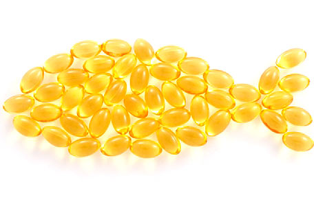
MegaRed Krill Oil – -in a sea of sameness in fish oils (all honey-colored capsules), maker Schiff came out with a variation (krill) and underscored that difference by not only coloring their product and package red, but extending it to the name itself. I’m not sure if it’s any different from a functional standpoint, but it definitely has made a mark in this crowded field by being different.

Christian Louboutin Shoes – – ok, you may be a little closer to this (literally) than me, but designer Christian Louboutin has staked a position in the market by coloring the soles of his namesake high heels bright red. Apparently this made enough of a difference that he was in court with Yves St Laurent regarding whether this design can be protected. Regardless of the outcome, red soles in this category have been permanently associated with Louboutin, and have drawn significant attention to his brand in a crowded field.

And differentiation, my friend, is what it’s all about. Don’t ever forget to think about color next time you’re taking potshots at this or that product when we’re shopping at PetSmart.

I liked this post! nice come back
847-409-8228 mobile
________________________________
LikeLike
I would be that Nigel likes Greenies. Nice blog, Dave!
LikeLike
LOVED this one!
LikeLike